
# 2.3.7 ProgressBar(進度條)
## 本節引言:
本節給大家帶來的是Android基本UI控件中的ProgressBar(進度條),ProgressBar的應用場景很多,比如 用戶登錄時,后臺在發請求,以及等待服務器返回信息,這個時候會用到進度條;或者當在進行一些比較 耗時的操作,需要等待一段較長的時間,這個時候如果沒有提示,用戶可能會以為程序Carsh或者手機死機 了,這樣會大大降低用戶體驗,所以在需要進行耗時操作的地方,添加上進度條,讓用戶知道當前的程序 在執行中,也可以直觀的告訴用戶當前任務的執行進度等!使用進度條可以給我帶來這樣的便利! 好了,開始講解本節內容~ 對了,ProgressBar官方API文檔:[ProgressBar](http://androiddoc.qiniudn.com/reference/android/widget/ProgressBar.html)
## 1.常用屬性講解與基礎實例
從官方文檔,我們看到了這樣一個類關系圖:
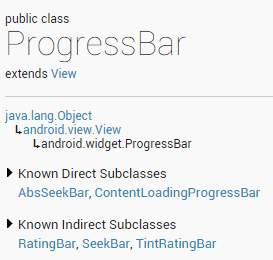
ProgressBar繼承與View類,直接子類有AbsSeekBar和ContentLoadingProgressBar, 其中AbsSeekBar的子類有SeekBar和RatingBar,可見這二者也是基于ProgressBar實現的
**常用屬性詳解:**
> * android:**max**:進度條的最大值
> * android:**progress**:進度條已完成進度值
> * android:**progressDrawable**:設置軌道對應的Drawable對象
> * android:**indeterminate**:如果設置成true,則進度條不精確顯示進度
> * android:**indeterminateDrawable**:設置不顯示進度的進度條的Drawable對象
> * android:**indeterminateDuration**:設置不精確顯示進度的持續時間
> * android:**secondaryProgress**:二級進度條,類似于視頻播放的一條是當前播放進度,一條是緩沖進度,前者通過progress屬性進行設置!
對應的再Java中我們可調用下述方法:
> * **getMax**():返回這個進度條的范圍的上限
> * **getProgress**():返回進度
> * **getSecondaryProgress**():返回次要進度
> * **incrementProgressBy**(int diff):指定增加的進度
> * **isIndeterminate**():指示進度條是否在不確定模式下
> * **setIndeterminate**(boolean indeterminate):設置不確定模式下
接下來來看看系統提供的默認的進度條的例子吧!
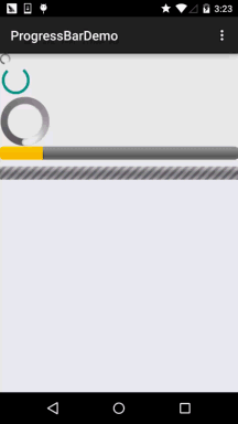
**系統默認進度條使用實例:**
**運行效果圖:**
**實現布局代碼:**
```
<LinearLayout xmlns:android="http://schemas.android.com/apk/res/android" xmlns:tools="http://schemas.android.com/tools" android:layout_width="match_parent" android:layout_height="match_parent" android:orientation="vertical" tools:context=".MainActivity"> <!-- 系統提供的圓形進度條,依次是大中小 --> <ProgressBar style="@android:style/Widget.ProgressBar.Small" android:layout_width="wrap_content" android:layout_height="wrap_content" /> <ProgressBar android:layout_width="wrap_content" android:layout_height="wrap_content" /> <ProgressBar style="@android:style/Widget.ProgressBar.Large" android:layout_width="wrap_content" android:layout_height="wrap_content" /> <!--系統提供的水平進度條--> <ProgressBar style="@android:style/Widget.ProgressBar.Horizontal" android:layout_width="match_parent" android:layout_height="wrap_content" android:max="100" android:progress="18" /> <ProgressBar style="@android:style/Widget.ProgressBar.Horizontal" android:layout_width="match_parent" android:layout_height="wrap_content" android:layout_marginTop="10dp" android:indeterminate="true" /> </LinearLayout>
```
好吧,除了第二個能看,其他的就算了...系統提供的肯定是滿足不了我們的需求的! 下面我們就來講解下實際開發中我們對進度條的處理!
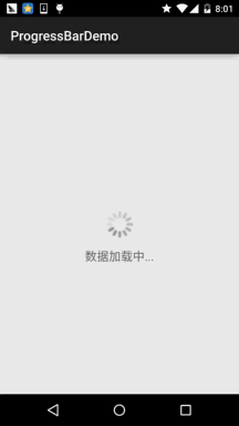
## 2.使用動畫來替代圓形進度條
第一個方案是,使用一套連續圖片,形成一個幀動畫,當需要進度圖的時候,讓動畫可見,不需要 的時候讓動畫不可見即可!而這個動畫,一般是使用AnimationDrawable來實現的!好的,我們來 定義一個AnimationDrawable文件:
PS:用到的圖片素材:[進度條圖片素材打包.zip](http://www.runoob.com/wp-content/uploads/2015/08/進度條動畫素材打包.zip)
**運行效果圖:**
 <p<b>實現步驟:
在res目錄下新建一個:anim文件件,然后創建amin_pgbar.xml的資源文件:
```
<?xml version="1.0" encoding="utf-8"?> <animation-list xmlns:android="http://schemas.android.com/apk/res/android" android:oneshot="false" > <item android:drawable="@drawable/loading_01" android:duration="200"/> <item android:drawable="@drawable/loading_02" android:duration="200"/> <item android:drawable="@drawable/loading_03" android:duration="200"/> <item android:drawable="@drawable/loading_04" android:duration="200"/> <item android:drawable="@drawable/loading_05" android:duration="200"/> <item android:drawable="@drawable/loading_06" android:duration="200"/> <item android:drawable="@drawable/loading_07" android:duration="200"/> <item android:drawable="@drawable/loading_08" android:duration="200"/> <item android:drawable="@drawable/loading_09" android:duration="200"/> <item android:drawable="@drawable/loading_10" android:duration="200"/> <item android:drawable="@drawable/loading_11" android:duration="200"/> <item android:drawable="@drawable/loading_12" android:duration="200"/> </animation-list>
```
接著寫個布局文件,里面僅僅有一個ImageView即可,用于顯示進度條,把src設置為上述drawable資源即可! 最后到MainActivity.java
```
public class MainActivity extends AppCompatActivity { private ImageView img_pgbar; private AnimationDrawable ad; @Override protected void onCreate(Bundle savedInstanceState) { super.onCreate(savedInstanceState); setContentView(R.layout.activity_main); img_pgbar = (ImageView) findViewById(R.id.img_pgbar); ad = (AnimationDrawable) img_pgbar.getDrawable(); img_pgbar.postDelayed(new Runnable() { @Override public void run() { ad.start(); } }, 100); } }
```
這里只是寫了如何啟動動畫,剩下的就你自己來了哦~在需要顯示進度條的時候,讓ImageView可見; 在不需要的時候讓他隱藏即可!另外其實Progressbar本身有一個indeterminateDrawable,只需把 這個參數設置成上述的動畫資源即可,但是進度條條的圖案大小是不能直接修改的,需要Java代碼中 修改,如果你設置了寬高,而且這個寬高過大的時候,你會看到有多個進度條...自己權衡下吧~
## 3.自定義圓形進度條
> 相信你看完2會吐槽,臥槽,這么坑爹,拿個動畫來坑人,哈哈,實際開發中都這樣,當然上述 這種情況只適用于不用顯示進度的場合,如果要顯示進度的場合就沒用處了,好吧,接下來看下 網上一個簡單的自定義圓形進度條!代碼還是比較簡單,容易理解,又興趣可以看看,或者進行相關擴展~
**運行效果圖:**

**實現代碼:**
**自定義View類:**
```
/**
* Created by Jay on 2015/8/5 0005.
*/ public class CirclePgBar extends View { private Paint mBackPaint; private Paint mFrontPaint; private Paint mTextPaint; private float mStrokeWidth = 50; private float mHalfStrokeWidth = mStrokeWidth / 2; private float mRadius = 200; private RectF mRect; private int mProgress = 0; //目標值,想改多少就改多少 private int mTargetProgress = 90; private int mMax = 100; private int mWidth; private int mHeight; public CirclePgBar(Context context) { super(context); init(); } public CirclePgBar(Context context, AttributeSet attrs) { super(context, attrs); init(); } public CirclePgBar(Context context, AttributeSet attrs, int defStyleAttr) { super(context, attrs, defStyleAttr); init(); } //完成相關參數初始化 private void init() { mBackPaint = new Paint(); mBackPaint.setColor(Color.WHITE); mBackPaint.setAntiAlias(true); mBackPaint.setStyle(Paint.Style.STROKE); mBackPaint.setStrokeWidth(mStrokeWidth); mFrontPaint = new Paint(); mFrontPaint.setColor(Color.GREEN); mFrontPaint.setAntiAlias(true); mFrontPaint.setStyle(Paint.Style.STROKE); mFrontPaint.setStrokeWidth(mStrokeWidth); mTextPaint = new Paint(); mTextPaint.setColor(Color.GREEN); mTextPaint.setAntiAlias(true); mTextPaint.setTextSize(80); mTextPaint.setTextAlign(Paint.Align.CENTER); } //重寫測量大小的onMeasure方法和繪制View的核心方法onDraw() @Override protected void onMeasure(int widthMeasureSpec, int heightMeasureSpec) { super.onMeasure(widthMeasureSpec, heightMeasureSpec); mWidth = getRealSize(widthMeasureSpec); mHeight = getRealSize(heightMeasureSpec); setMeasuredDimension(mWidth, mHeight); } @Override protected void onDraw(Canvas canvas) { initRect(); float angle = mProgress / (float) mMax * 360; canvas.drawCircle(mWidth / 2, mHeight / 2, mRadius, mBackPaint); canvas.drawArc(mRect, -90, angle, false, mFrontPaint); canvas.drawText(mProgress + "%", mWidth / 2 + mHalfStrokeWidth, mHeight / 2 + mHalfStrokeWidth, mTextPaint); if (mProgress < mTargetProgress) { mProgress += 1; invalidate(); } } public int getRealSize(int measureSpec) { int result = 1; int mode = MeasureSpec.getMode(measureSpec); int size = MeasureSpec.getSize(measureSpec); if (mode == MeasureSpec.AT_MOST || mode == MeasureSpec.UNSPECIFIED) { //自己計算 result = (int) (mRadius * 2 + mStrokeWidth); } else { result = size; } return result; } private void initRect() { if (mRect == null) { mRect = new RectF(); int viewSize = (int) (mRadius * 2); int left = (mWidth - viewSize) / 2; int top = (mHeight - viewSize) / 2; int right = left + viewSize; int bottom = top + viewSize; mRect.set(left, top, right, bottom); } } }
```
然后在布局文件中加上:
```
<com.jay.progressbardemo.CirclePgBar android:layout_width="match_parent" android:layout_height="match_parent"/>
```
就是這么簡單~
## 本節小結:
本節給大家介紹了Android中的常用控件:ProgressBar講解了基本用法,以及實際開發中 對于進度條的兩種實現方法,第二個自定義進度條可以自行完善,然后用到實際開發中~! 好的,本節就到這里,謝謝~
- 1.0 Android基礎入門教程
- 1.0.1 2015年最新Android基礎入門教程目錄
- 1.1 背景相關與系統架構分析
- 1.2 開發環境搭建
- 1.2.1 使用Eclipse + ADT + SDK開發Android APP
- 1.2.2 使用Android Studio開發Android APP
- 1.3 SDK更新不了問題解決
- 1.4 Genymotion模擬器安裝
- 1.5.1 Git使用教程之本地倉庫的基本操作
- 1.5.2 Git之使用GitHub搭建遠程倉庫
- 1.6 .9(九妹)圖片怎么玩
- 1.7 界面原型設計
- 1.8 工程相關解析(各種文件,資源訪問)
- 1.9 Android程序簽名打包
- 1.11 反編譯APK獲取代碼&資源
- 2.1 View與ViewGroup的概念
- 2.2.1 LinearLayout(線性布局)
- 2.2.2 RelativeLayout(相對布局)
- 2.2.3 TableLayout(表格布局)
- 2.2.4 FrameLayout(幀布局)
- 2.2.5 GridLayout(網格布局)
- 2.2.6 AbsoluteLayout(絕對布局)
- 2.3.1 TextView(文本框)詳解
- 2.3.2 EditText(輸入框)詳解
- 2.3.3 Button(按鈕)與ImageButton(圖像按鈕)
- 2.3.4 ImageView(圖像視圖)
- 2.3.5.RadioButton(單選按鈕)&Checkbox(復選框)
- 2.3.6 開關按鈕ToggleButton和開關Switch
- 2.3.7 ProgressBar(進度條)
- 2.3.8 SeekBar(拖動條)
- 2.3.9 RatingBar(星級評分條)
- 2.4.1 ScrollView(滾動條)
- 2.4.2 Date & Time組件(上)
- 2.4.3 Date & Time組件(下)
- 2.4.4 Adapter基礎講解
- 2.4.5 ListView簡單實用
- 2.4.6 BaseAdapter優化
- 2.4.7ListView的焦點問題
- 2.4.8 ListView之checkbox錯位問題解決
- 2.4.9 ListView的數據更新問題
- 2.5.0 構建一個可復用的自定義BaseAdapter
- 2.5.1 ListView Item多布局的實現
- 2.5.2 GridView(網格視圖)的基本使用
- 2.5.3 Spinner(列表選項框)的基本使用
- 2.5.4 AutoCompleteTextView(自動完成文本框)的基本使用
- 2.5.5 ExpandableListView(可折疊列表)的基本使用
- 2.5.6 ViewFlipper(翻轉視圖)的基本使用
- 2.5.7 Toast(吐司)的基本使用
- 2.5.8 Notification(狀態欄通知)詳解
- 2.5.9 AlertDialog(對話框)詳解
- 2.6.0 其他幾種常用對話框基本使用
- 2.6.1 PopupWindow(懸浮框)的基本使用
- 2.6.2 菜單(Menu)
- 2.6.3 ViewPager的簡單使用
- 2.6.4 DrawerLayout(官方側滑菜單)的簡單使用
- 3.1.1 基于監聽的事件處理機制
- 3.2 基于回調的事件處理機制
- 3.3 Handler消息傳遞機制淺析
- 3.4 TouchListener PK OnTouchEvent + 多點觸碰
- 3.5 監聽EditText的內容變化
- 3.6 響應系統設置的事件(Configuration類)
- 3.7 AnsyncTask異步任務
- 3.8 Gestures(手勢)
- 4.1.1 Activity初學乍練
- 4.1.2 Activity初窺門徑
- 4.1.3 Activity登堂入室
- 4.2.1 Service初涉
- 4.2.2 Service進階
- 4.2.3 Service精通
- 4.3.1 BroadcastReceiver牛刀小試
- 4.3.2 BroadcastReceiver庖丁解牛
- 4.4.2 ContentProvider再探——Document Provider
- 4.5.1 Intent的基本使用
- 4.5.2 Intent之復雜數據的傳遞
- 5.1 Fragment基本概述
- 5.2.1 Fragment實例精講——底部導航欄的實現(方法1)
- 5.2.2 Fragment實例精講——底部導航欄的實現(方法2)
- 5.2.3 Fragment實例精講——底部導航欄的實現(方法3)
- 5.2.4 Fragment實例精講——底部導航欄+ViewPager滑動切換頁面
- 5.2.5 Fragment實例精講——新聞(購物)類App列表Fragment的簡單實現
- 6.1 數據存儲與訪問之——文件存儲讀寫
- 6.2 數據存儲與訪問之——SharedPreferences保存用戶偏好參數
- 6.3.1 數據存儲與訪問之——初見SQLite數據庫
- 6.3.2 數據存儲與訪問之——又見SQLite數據庫
- 7.1.1 Android網絡編程要學的東西與Http協議學習
- 7.1.2 Android Http請求頭與響應頭的學習
- 7.1.3 Android HTTP請求方式:HttpURLConnection
- 7.1.4 Android HTTP請求方式:HttpClient
- 7.2.1 Android XML數據解析
- 7.2.2 Android JSON數據解析
- 7.3.1 Android 文件上傳
- 7.3.2 Android 文件下載(1)
- 7.3.3 Android 文件下載(2)
- 7.4 Android 調用 WebService
- 7.5.1 WebView(網頁視圖)基本用法
- 7.5.2 WebView和JavaScrip交互基礎
- 7.5.3 Android 4.4后WebView的一些注意事項
- 7.5.4 WebView文件下載
- 7.5.5 WebView緩存問題
- 7.5.6 WebView處理網頁返回的錯誤碼信息
- 7.6.1 Socket學習網絡基礎準備
- 7.6.2 基于TCP協議的Socket通信(1)
- 7.6.3 基于TCP協議的Socket通信(2)
- 7.6.4 基于UDP協議的Socket通信
- 8.1.1 Android中的13種Drawable小結 Part 1
- 8.1.2 Android中的13種Drawable小結 Part 2
- 8.1.3 Android中的13種Drawable小結 Part 3
- 8.2.1 Bitmap(位圖)全解析 Part 1
- 8.2.2 Bitmap引起的OOM問題
- 8.3.1 三個繪圖工具類詳解
- 8.3.2 繪圖類實戰示例
- 8.3.3 Paint API之—— MaskFilter(面具)
- 8.3.4 Paint API之—— Xfermode與PorterDuff詳解(一)
- 8.3.5 Paint API之—— Xfermode與PorterDuff詳解(二)
- 8.3.6 Paint API之—— Xfermode與PorterDuff詳解(三)
- 8.3.7 Paint API之—— Xfermode與PorterDuff詳解(四)
- 8.3.8 Paint API之—— Xfermode與PorterDuff詳解(五)
- 8.3.9 Paint API之—— ColorFilter(顏色過濾器)(1/3)
- 8.3.10 Paint API之—— ColorFilter(顏色過濾器)(2-3)
- 8.3.11 Paint API之—— ColorFilter(顏色過濾器)(3-3)
- 8.3.12 Paint API之—— PathEffect(路徑效果)
- 8.3.13 Paint API之—— Shader(圖像渲染)
- 8.3.14 Paint幾個枚舉/常量值以及ShadowLayer陰影效果
- 8.3.15 Paint API之——Typeface(字型)
- 8.3.16 Canvas API詳解(Part 1)
- 8.3.17 Canvas API詳解(Part 2)剪切方法合集
- 8.3.18 Canvas API詳解(Part 3)Matrix和drawBitmapMash
- 8.4.1 Android動畫合集之幀動畫
- 8.4.2 Android動畫合集之補間動畫
- 8.4.3 Android動畫合集之屬性動畫-初見
- 8.4.4 Android動畫合集之屬性動畫-又見
- 9.1 使用SoundPool播放音效(Duang~)
- 9.2 MediaPlayer播放音頻與視頻
- 9.3 使用Camera拍照
- 9.4 使用MediaRecord錄音
- 10.1 TelephonyManager(電話管理器)
- 10.2 SmsManager(短信管理器)
- 10.3 AudioManager(音頻管理器)
- 10.4 Vibrator(振動器)
- 10.5 AlarmManager(鬧鐘服務)
- 10.6 PowerManager(電源服務)
- 10.7 WindowManager(窗口管理服務)
- 10.8 LayoutInflater(布局服務)
- 10.9 WallpaperManager(壁紙管理器)
- 10.10 傳感器專題(1)——相關介紹
- 10.11 傳感器專題(2)——方向傳感器
- 10.12 傳感器專題(3)——加速度/陀螺儀傳感器
- 10.12 傳感器專題(4)——其他傳感器了解
- 10.14 Android GPS初涉
- 11.0《2015最新Android基礎入門教程》完結散花~