
# QtJambi 中的小部件
> 原文: [http://zetcode.com/gui/qtjambi/widgets/](http://zetcode.com/gui/qtjambi/widgets/)
在 QtJambi 編程教程的這一部分中,我們將介紹 QtJambi 小部件。
小部件是 GUI 應用的基本構建塊。 多年來,幾個小部件已成為所有 OS 平臺上所有工具包中的標準。 例如,按鈕,復選框或滾動條。 QtJambi 有一組豐富的小部件,可以滿足大多數編程需求。 可以將更多專門的窗口小部件創建為自定義窗口小部件。
## `QCheckBox`
`QCheckBox`是具有兩種狀態的窗口小部件:開和關。 接通狀態通過復選標記顯示。 它用來表示一些布爾屬性。 `QCheckBox`小部件提供一個帶有文本標簽的復選框。
```java
package com.zetcode;
import com.trolltech.qt.core.Qt.FocusPolicy;
import com.trolltech.qt.gui.QApplication;
import com.trolltech.qt.gui.QCheckBox;
import com.trolltech.qt.gui.QWidget;
/**
* ZetCode QtJambi tutorial
*
* This program uses QCheckBox
* widget to show/hide the title
* of the window
*
* @author jan bodnar
* website zetcode.com
* last modified March 2009
*/
public class JambiApp extends QWidget {
public JambiApp() {
setWindowTitle("QCheckBox");
initUI();
resize(250, 150);
move(300, 300);
show();
}
public void initUI() {
QCheckBox cb = new QCheckBox("Show Title", this);
cb.setFocusPolicy(FocusPolicy.NoFocus);
cb.setChecked(true);
cb.toggled.connect(this, "onChanged(boolean)");
cb.move(50, 50);
}
public void onChanged(boolean state) {
if (state) {
setWindowTitle("QCheckBox");
} else {
setWindowTitle("");
}
}
public static void main(String[] args) {
QApplication.initialize(args);
new JambiApp();
QApplication.exec();
}
}
```
在我們的示例中,我們在窗口上放置了一個復選框。 復選框顯示/隱藏窗口的標題。
```java
setWindowTitle("QCheckBox");
```
在構建窗口期間,我們為窗口設置標題。
```java
QCheckBox cb = new QCheckBox("Show Title", this);
```
`QCheckBox`小部件已創建。 構造器的第一個參數是其文本標簽。 第二個參數是父窗口小部件。
```java
cb.setFocusPolicy(FocusPolicy.NoFocus);
```
我不喜歡聚焦復選框的視覺表示。 此行禁用焦點。
```java
cb.setChecked(true);
```
標題在應用的開始處可見。 因此,也必須選中該復選框。
```java
cb.toggled.connect(this, "onChanged(boolean)");
```
復選框的狀態更改時,會發出`toggled()`信號。 發出信號時,我們觸發`onChanged()`方法。
```java
if (state) {
setWindowTitle("QCheckBox");
} else {
setWindowTitle("");
}
```
根據復選框的狀態,我們顯示或隱藏窗口的標題。
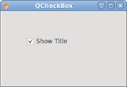
圖:`QCheckBox`
## `QLabel`
`QLabel`小部件用于顯示文本或圖像。 沒有用戶交互。
```java
package com.zetcode;
import com.trolltech.qt.gui.QApplication;
import com.trolltech.qt.gui.QFont;
import com.trolltech.qt.gui.QLabel;
import com.trolltech.qt.gui.QVBoxLayout;
import com.trolltech.qt.gui.QWidget;
/**
* ZetCode QtJambi tutorial
*
* This program uses QLabel to
* show lyrics of a song
*
* @author jan bodnar
* website zetcode.com
* last modified March 2009
*/
public class JambiApp extends QWidget {
public JambiApp() {
setWindowTitle("You know I'm no Good");
initUI();
move(300, 300);
show();
}
private void initUI() {
String text =
"Meet you downstairs in the bar and heard\n" +
"your rolled up sleeves and your skull t-shirt\n" +
"You say why did you do it with him today?\n" +
"and sniff me out like I was Tanqueray\n\n" +
"cause you're my fella, my guy\n" +
"hand me your stella and fly\n" +
"by the time I'm out the door\n" +
"you tear men down like Roger Moore\n\n" +
"I cheated myself\n" +
"like I knew I would\n" +
"I told ya, I was trouble\n" +
"you know that I'm no good";
QLabel label = new QLabel(text, this);
label.setFont(new QFont("Purisa", 9));
QVBoxLayout vbox = new QVBoxLayout();
vbox.addWidget(label);
setLayout(vbox);
}
public static void main(String[] args) {
QApplication.initialize(args);
new JambiApp();
QApplication.exec();
}
}
```
我們的示例在窗口中顯示了歌曲的歌詞。
```java
String text =
"Meet you downstairs in the bar and heard\n" +
...
```
我們定義了多行文字。
```java
QLabel label = new QLabel(text, this);
label.setFont(new QFont("Purisa", 9));
```
我們創建標簽小部件并更改其字體。
```java
QVBoxLayout vbox = new QVBoxLayout();
vbox.addWidget(label);
setLayout(vbox);
```
代替手動編碼標簽的位置和大小,我們將標簽放入盒子布局中。

圖:`QLabel`
## `QLineEdit`
`QLineEdit`是一個小部件,允許輸入和編輯單行純文本。 `QLineEdit`小部件具有撤消/重做,剪切/粘貼和拖放功能。
```java
package com.zetcode;
import com.trolltech.qt.gui.QApplication;
import com.trolltech.qt.gui.QLabel;
import com.trolltech.qt.gui.QLineEdit;
import com.trolltech.qt.gui.QWidget;
/**
* ZetCode QtJambi tutorial
*
* This program shows text
* which is entered in a QLineEdit
* widget in a QLabel widget
*
* @author jan bodnar
* website zetcode.com
* last modified March 2009
*/
public class JambiApp extends QWidget {
QLabel label;
public JambiApp() {
setWindowTitle("QLineEdit");
initUI();
resize(250, 200);
move(300, 300);
show();
}
private void initUI() {
label = new QLabel(this);
QLineEdit edit = new QLineEdit(this);
edit.textChanged.connect(this, "onChanged(String)");
edit.move(60, 100);
label.move(60, 40);
}
private void onChanged(String text) {
label.setText(text);
label.adjustSize();
}
public static void main(String[] args) {
QApplication.initialize(args);
new JambiApp();
QApplication.exec();
}
}
```
在我們的示例中,我們顯示了兩個小部件。 行編輯和標簽小部件。 輸入到行編輯中的文本顯示在標簽窗口小部件中。
```java
QLineEdit edit = new QLineEdit(this);
```
`QLineEdit`小部件已創建。
```java
edit.textChanged.connect(this, "onChanged(String)");
```
當我們在行編輯中鍵入或刪除某些文本時,將觸發`onChanged()`方法。
```java
private void onChanged(String text) {
label.setText(text);
label.adjustSize();
}
```
在`onChanged()`方法中,我們將行編輯的內容設置為標簽窗口小部件。 `adjustSize()`方法確保所有文本都是可見的。
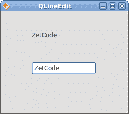
圖:`QLineEdit`小部件
## `ToggleButton`
切換按鈕是設置了可檢查標志的按鈕。 切換按鈕是具有兩種狀態的按鈕。 已按下但未按下。 通過單擊可以在這兩種狀態之間切換。 在某些情況下此功能非常合適。
```java
package com.zetcode;
import com.trolltech.qt.gui.QApplication;
import com.trolltech.qt.gui.QColor;
import com.trolltech.qt.gui.QPushButton;
import com.trolltech.qt.gui.QWidget;
import java.util.Formatter;
/**
* ZetCode QtJambi tutorial
*
* This program uses toggle buttons to
* change the background color of
* a widget
*
* @author jan bodnar
* website zetcode.com
* last modified March 2009
*/
public class JambiApp extends QWidget {
private QWidget square;
private QColor color;
private QPushButton redb;
private QPushButton greenb;
private QPushButton blueb;
public JambiApp() {
setWindowTitle("Toggle Buttons");
initUI();
resize(350, 240);
move(300, 300);
show();
}
private void initUI() {
color = new QColor();
redb = new QPushButton("Red", this);
redb.setCheckable(true);
greenb = new QPushButton("Green", this);
greenb.setCheckable(true);
blueb = new QPushButton("Blue", this);
blueb.setCheckable(true);
redb.toggled.connect(this, "onToggled()");
greenb.toggled.connect(this, "onToggled()");
blueb.toggled.connect(this, "onToggled()");
square = new QWidget(this);
square.setStyleSheet("QWidget { background-color: black }");
redb.move(30, 30);
greenb.move(30, 80);
blueb.move(30, 130);
square.setGeometry(150, 25, 150, 150);
}
public void onToggled() {
int red = color.red();
int green = color.green();
int blue = color.blue();
if (redb.isChecked()) {
red = 255;
} else {
red = 0;
}
if (greenb.isChecked()) {
green = 255;
} else {
green = 0;
}
if (blueb.isChecked()) {
blue = 255;
} else {
blue = 0;
}
color = new QColor(red, green, blue);
Formatter fmt = new Formatter();
fmt.format("QWidget { background-color: %s }", color.name());
square.setStyleSheet(fmt.toString());
}
public static void main(String[] args) {
QApplication.initialize(args);
new JambiApp();
QApplication.exec();
}
}
```
在代碼示例中,我們使用三個切換按鈕來更改矩形小部件的顏色。
```java
private QWidget square;
private QColor color;
private QPushButton redb;
private QPushButton greenb;
private QPushButton blueb;
```
我們定義了五個對象。 正方形小部件是`QWidget`,它顯示顏色。 `color`變量用于保存顏色值。 這三個按鈕是切換按鈕,用于混合顏色值。
```java
redb = new QPushButton("Red", this);
redb.setCheckable(true);
```
我們創建一個`QPushButton`小部件。 `setCheckable()`方法將按鈕更改為切換按鈕。
```java
redb.toggled.connect(this, "onToggled()");
greenb.toggled.connect(this, "onToggled()");
blueb.toggled.connect(this, "onToggled()");
```
所有三個按鈕都插入到一個方法調用中,即`onToggled()`方法。
```java
square = new QWidget(this);
square.setStyleSheet("QWidget { background-color: black }");
```
我們創建方形小部件。 一開始是黑色的。 在 QtJambi 中,我們使用樣式表來自定義小部件的外觀。
在`onToggled()`方法內部,我們確定顏色值并將正方形小部件更新為新顏色。
```java
int red = color.red();
int green = color.green();
int blue = color.blue();
```
在這里,我們確定方形小部件的當前顏色。
```java
if (redb.isChecked()) {
red = 255;
} else {
red = 0;
}
```
根據紅色切換按鈕的狀態,更改顏色的紅色部分。
```java
color = new QColor(red, green, blue);
```
我們創建一個新的顏色值。
```java
Formatter fmt = new Formatter();
fmt.format("QWidget { background-color: %s }", color.name());
```
這兩行創建樣式表的文本。 我們使用 Java `Formatter`對象。
```java
square.setStyleSheet(fmt.toString());
```
正方形的顏色已更新。
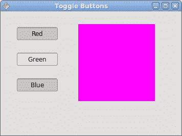
圖:開關按鈕
## `QComboBox`
`QComboBox`是一個小部件,允許用戶從選項列表中進行選擇。 這是一個顯示當前項目的選擇小部件,可以彈出可選擇項目的列表。 組合框可能是可編輯的。 它以占用最少屏幕空間的方式向用戶顯示選項列表。
```java
package com.zetcode;
import com.trolltech.qt.gui.QApplication;
import com.trolltech.qt.gui.QComboBox;
import com.trolltech.qt.gui.QLabel;
import com.trolltech.qt.gui.QWidget;
/**
* ZetCode QtJambi tutorial
*
* This program uses the QComboBox widget.
* The option selected from the combo box is
* displayed in the label widget.
*
* @author jan bodnar
* website zetcode.com
* last modified March 2009
*/
public class JambiApp extends QWidget {
QLabel label;
public JambiApp() {
setWindowTitle("QComboBox");
initUI();
resize(250, 200);
move(300, 300);
show();
}
private void initUI() {
label = new QLabel("Ubuntu", this);
QComboBox combo = new QComboBox(this);
combo.addItem("Ubuntu");
combo.addItem("Fedora");
combo.addItem("Mandriva");
combo.addItem("Red Hat");
combo.addItem("Mint");
combo.currentStringChanged.connect(this, "OnActivated(String)");
combo.move(50, 30);
label.move(50, 100);
}
private void OnActivated(String text) {
label.setText(text);
label.adjustSize();
}
public static void main(String[] args) {
QApplication.initialize(args);
new JambiApp();
QApplication.exec();
}
}
```
在我們的代碼示例中,我們有兩個小部件。 組合框和標簽小部件。 從組合框中選擇的選項顯示在標簽中。
```java
label = new QLabel("Ubuntu", this);
```
這是一個標簽,它將顯示組合框中當前選擇的選項。
```java
QComboBox combo = new QComboBox(this);
```
我們創建`QComboBox`小部件的實例。
```java
combo.addItem("Ubuntu");
combo.addItem("Fedora");
combo.addItem("Mandriva");
combo.addItem("Red Hat");
combo.addItem("Mint");
```
組合框將填充值。
```java
combo.currentStringChanged.connect(this, "OnActivated(String)");
```
當我們從組合框中選擇一個選項時,將觸發`OnActivated()`方法。
```java
private void OnActivated(String text) {
label.setText(text);
label.adjustSize();
}
```
在`OnActivated()`方法中,我們將標簽小部件更新為從組合框中選擇的當前字符串。
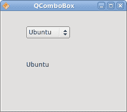
圖:`QComboBox`小部件
在 QtJambi 教程的這一部分中,我們介紹了幾個 QtJambi 小部件。
- ZetCode 數據庫教程
- MySQL 教程
- MySQL 簡介
- MySQL 安裝
- MySQL 的第一步
- MySQL 快速教程
- MySQL 存儲引擎
- MySQL 數據類型
- 在 MySQL 中創建,更改和刪除表
- MySQL 表達式
- 在 MySQL 中插入,更新和刪除數據
- MySQL 中的SELECT語句
- MySQL 子查詢
- MySQL 約束
- 在 MySQL 中導出和導入數據
- 在 MySQL 中連接表
- MySQL 函數
- MySQL 中的視圖
- MySQL 中的事務
- MySQL 存儲過程
- MySQL Python 教程
- MySQL Perl 教程
- MySQL & Perl DBI
- 使用 Perl 連接到 MySQL 數據庫
- MySQL 中的 Perl 錯誤處理
- 使用 Perl 進行 MySQL 查詢
- 在 MySQL 中使用 Perl 綁定參數&列
- 在 MySQL 中使用 Perl 處理圖像
- 使用 Perl 獲取 MySQL 元數據
- Perl 的 MySQL 事務
- MySQL C API 編程教程
- MySQL Visual Basic 教程
- MySQL PHP 教程
- MySQL Java 教程
- MySQL Ruby 教程
- MySQL C# 教程
- SQLite 教程
- SQLite 簡介
- sqlite3 命令行工具
- 在 SQLite 中創建,刪除和更改表
- SQLite 表達式
- SQLite 插入,更新,刪除數據
- SQLite SELECT語句
- SQLite 約束
- SQLite 連接表
- SQLite 函數
- SQLite 視圖,觸發器,事務
- SQLite C 教程
- SQLite Python 教程
- SQLite Perl 教程
- Perl DBI
- 使用 Perl 連接到 SQLite 數據庫
- SQLite Perl 錯誤處理
- 使用 Perl 的 SQLite 查詢
- 使用 Perl 綁定 SQLite 參數&列
- 使用 Perl 在 SQLite 中處理圖像
- 使用 Perl 獲取 SQLite 元數據
- 使用 Perl 進行 SQLite 事務
- SQLite Ruby 教程
- 連接到 SQLite 數據庫
- 在 SQLite 中使用 Ruby 進行 SQL 查詢
- 綁定參數
- 處理圖像
- 使用 Ruby 獲取 SQLite 元數據
- Ruby 的 SQLite 事務
- SQLite C# 教程
- SQLite C# 簡介
- 使用SqliteDataReader檢索數據
- ADO.NET 數據集
- 使用 C# 在 SQLite 中處理圖像
- 使用 C# 獲取 SQLite 元數據
- 使用 C# 的 SQLite 事務
- SQLite Visual Basic 教程
- SQLite Visual Basic 簡介
- 使用SqliteDataReader檢索數據
- ADO.NET 的數據集
- 使用 Visual Basic 在 SQLite 中處理圖像
- 使用 Visual Basic 獲取 SQLite 元數據
- 使用 Visual Basic 的 SQLite 事務
- PostgreSQL C 教程
- PostgreSQL Ruby 教程
- PostgreSQL PHP 教程
- PostgreSQL PHP 編程簡介
- 在 PostgreSQL 中使用 PHP 檢索數據
- 在 PostgreSQL 中使用 PHP 處理圖像
- 用 PHP 獲取 PostgreSQL 元數據
- 在 PostgreSQL 中使用 PHP 進行事務
- PostgreSQL Java 教程
- Apache Derby 教程
- Derby 簡介
- Derby 的安裝&配置
- Derby 工具
- ij 工具
- Derby 中的 SQL 查詢
- 在 Derby 中使用 JDBC 進行編程
- Derby 安全
- 使用 Derby & Apache Tomcat
- NetBeans 和 Derby
- SQLAlchemy 教程
- SQLAlchemy 簡介
- 原始 SQL
- 模式定義語言
- SQL 表達式語言
- SQLAlchemy 中的對象關系映射器
- MongoDB PHP 教程
- MongoDB JavaScript 教程
- MongoDB Ruby 教程
- Spring JdbcTemplate 教程
- JDBI 教程
- MyBatis 教程
- Hibernate Derby 教程
- ZetCode .NET 教程
- Visual Basic 教程
- Visual Basic
- Visual Basic 語法結構
- 基本概念
- Visual Basic 數據類型
- Visual Basic 中的字符串
- 運算符
- 控制流
- Visual Basic 數組
- Visual Basic 中的過程&函數
- 在 Visual Basic 中組織代碼
- 面向對象編程
- Visual Basic 中的面向對象編程 II
- Visual Basic 中的集合
- 輸入和輸出
- C# 教程
- C# 語言
- C# 語法結構
- C# 基礎
- C# 數據類型
- C# 中的字符串
- C# 運算符
- C# 中的流控制
- C# 數組
- C# 面向對象編程
- C# 中的方法
- C# 面向對象編程 II
- C# 屬性
- C# 結構
- C# 委托
- 命名空間
- C# 集合
- C# 輸入和輸出
- C# 目錄教程
- C# 字典教程
- 在 C# 中讀取文本文件
- C# 中的日期和時間
- 在 C# 中讀取網頁
- C# HttpClient教程
- ASP.NET Core 教程
- ZetCode 圖形教程
- Java 2D 游戲教程
- Java 游戲基礎
- 動畫
- 移動精靈
- 碰撞檢測
- Java 益智游戲
- Java Snake
- Breakout 游戲
- Java 俄羅斯方塊
- Java 吃豆人
- Java 太空侵略者
- Java 掃雷
- Java 推箱子
- Java 2D 教程
- 介紹
- 基本繪圖
- 形狀和填充
- 透明度
- 合成
- 剪裁
- 變換
- 特效
- 圖像
- 文字和字體
- 命中測試,移動物體
- 俄羅斯方塊
- Cario 圖形教程
- Cario 圖形庫
- Cario 定義
- Cairo 后端
- Cairo 基本圖形
- 形狀和填充
- 漸變
- 透明度
- 合成
- 剪裁和遮罩
- 變換
- Cairo 文字
- Cairo 中的圖像
- 根窗口
- PyCairo 教程
- PyCairo 簡介
- PyCairo 后端
- PyCairo 中的基本繪圖
- PyCairo 形狀和填充
- PyCairo 漸變
- PyCairo 剪裁&遮罩
- PyCairo 的透明度
- PyCairo 中的變換
- PyCairo 中的文字
- PyCairo 中的圖像
- 根窗口
- HTML5 畫布教程
- 介紹
- HTML5 畫布中的直線
- HTML5 畫布形狀
- HTML5 畫布填充
- HTML5 畫布中的透明度
- HTML5 畫布合成
- HTML5 canvas 中的變換
- HTML5 畫布中的文字
- HTML5 畫布中的動畫
- HTML5 畫布中的 Snake
- ZetCode GUI 教程
- Windows API 教程
- Windows API 簡介
- Windows API main函數
- Windows API 中的系統函數
- Windows API 中的字符串
- Windows API 中的日期和時間
- Windows API 中的一個窗口
- UI 的第一步
- Windows API 菜單
- Windows API 對話框
- Windows API 控件 I
- Windows API 控件 II
- Windows API 控件 III
- Windows API 中的高級控件
- Windows API 中的自定義控件
- Windows API 中的 GDI
- PyQt4 教程
- PyQt4 簡介
- PyQt4 中的第一個程序
- PyQt4 中的菜單和工具欄
- PyQt4 中的布局管理
- PyQt4 中的事件和信號
- PyQt4 中的對話框
- PyQt4 小部件
- PyQt4 小部件 II
- PyQt4 中的拖放
- PyQt4 中的繪圖
- PyQt4 中的自定義小部件
- PyQt4 中的俄羅斯方塊游戲
- PyQt5 教程
- PyQt5 簡介
- PyQt5 日期和時間
- PyQt5 中的第一個程序
- PyQt5 中的菜單和工具欄
- PyQt5 中的布局管理
- PyQt5 中的事件和信號
- PyQt5 中的對話框
- PyQt5 小部件
- PyQt5 小部件 II
- PyQt5 拖放
- PyQt5 中的繪圖
- PyQt5 中的自定義小部件
- PyQt5 中的俄羅斯方塊
- Qt4 教程
- Qt4 工具包簡介
- Qt4 工具類
- Qt4 中的字符串
- Qt4 中的日期和時間
- 在 Qt4 中使用文件和目錄
- Qt4 中的第一個程序
- Qt4 中的菜單和工具欄
- Qt4 中的布局管理
- Qt4 中的事件和信號
- Qt4 小部件
- Qt4 小部件 II
- Qt4 中的繪圖
- Qt4 中的自定義小部件
- Qt4 中的打磚塊游戲
- Qt5 教程
- Qt5 工具包簡介
- Qt5 中的字符串
- Qt5 中的日期和時間
- Qt5 中的容器
- 在 Qt5 中處理文件和目錄
- Qt5 中的第一個程序
- Qt5 中的菜單和工具欄
- Qt5 中的布局管理
- Qt5 中的事件和信號
- Qt5 小部件
- Qt5 小部件 II
- Qt5 中的繪圖
- Qt5 中的自定義小部件
- Qt5 中的貪食蛇
- Qt5 中的打磚塊游戲
- PySide 教程
- PySide 工具包簡介
- PySide 中的第一個程序
- PySide 中的菜單和工具欄
- PySide 中的布局管理
- PySide 中的事件和信號
- PySide 中的對話框
- PySide 小部件
- PySide 小部件 II
- 在 PySide 中拖放
- 在 PySide 中繪圖
- PySide 中的自定義小部件
- PySide 中的俄羅斯方塊游戲
- Tkinter 教程
- Tkinter 簡介
- Tkinter 中的布局管理
- Tkinter 標準小部件屬性
- Tkinter 小部件
- Tkinter 中的菜單和工具欄
- Tkinter 中的對話框
- Tkinter 中的繪圖
- Tkinter 中的貪食蛇
- Tcl/Tk 教程
- Tcl/Tk 簡介
- Tcl/Tk 中的布局管理
- Tcl/Tk 小部件
- Tcl/Tk 中的菜單和工具欄
- Tcl/Tk 中的對話框
- Tcl/Tk 繪圖
- 貪食蛇
- Qt 快速教程
- Java Swing 教程
- Java Swing 簡介
- Java Swing 首個程序
- Java Swing 中的菜單和工具欄
- Swing 布局管理
- GroupLayout管理器
- Java Swing 事件
- 基本的 Swing 組件
- 基本的 Swing 組件 II
- Java Swing 對話框
- Java Swing 模型架構
- Swing 中的拖放
- Swing 中的繪圖
- Java Swing 中的可調整大小的組件
- Java Swing 中的益智游戲
- 俄羅斯方塊
- JavaFX 教程
- JavaFX 簡介
- JavaFX 首個程序
- JavaFX 布局窗格
- 基本的 JavaFX 控件
- 基本 JavaFX 控件 II
- JavaFX 事件
- JavaFX 效果
- JavaFX 動畫
- JavaFX 畫布
- JavaFX 圖表
- Java SWT 教程
- Java SWT 簡介
- Java SWT 中的布局管理
- Java SWT 中的菜單和工具欄
- Java SWT 中的小部件
- Table小部件
- Java SWT 中的對話框
- Java SWT 繪圖
- Java SWT 中的貪食蛇
- wxWidgets 教程
- wxWidgets 簡介
- wxWidgets 助手類
- wxWidgets 中的第一個程序
- wxWidgets 中的菜單和工具欄
- wxWidgets 中的布局管理
- wxWidgets 中的事件
- wxWidgets 中的對話框
- wxWidgets 小部件
- wxWidgets 小部件 II
- wxWidgets 中的拖放
- wxWidgets 中的設備上下文
- wxWidgets 中的自定義小部件
- wxWidgets 中的俄羅斯方塊游戲
- wxPython 教程
- wxPython 簡介
- 第一步
- 菜單和工具欄
- wxPython 中的布局管理
- wxPython 中的事件
- wxPython 對話框
- 小部件
- wxPython 中的高級小部件
- wxPython 中的拖放
- wxPython 圖形
- 創建自定義小部件
- wxPython 中的應用框架
- wxPython 中的俄羅斯方塊游戲
- C# Winforms Mono 教程
- Mono Winforms 簡介
- Mono Winforms 中的第一步
- Mono Winforms 中的布局管理
- Mono Winforms 中的菜單和工具欄
- Mono Winforms 中的基本控件
- Mono Winforms 中的高級控件
- 對話框
- Mono Winforms 中的拖放
- Mono Winforms 中的繪圖
- Mono Winforms 中的貪食蛇
- Java Gnome 教程
- Java Gnome 簡介
- Java Gnome 的第一步
- Java Gnome 中的布局管理
- Java Gnome 中的布局管理 II
- Java Gnome 中的菜單
- Java Gnome 中的工具欄
- Java Gnome 中的事件
- Java Gnome 中的小部件
- Java Gnome 中的小部件 II
- Java Gnome 中的高級小部件
- Java Gnome 中的對話框
- Java Gnome 中的 Pango
- 在 Java Gnome 中用 Cairo 繪圖
- Cario 繪圖 II
- Java Gnome 中的貪食蛇
- QtJambi 教程
- QtJambi 簡介
- QtJambi 中的布局管理
- QtJambi 中的小部件
- QtJambi 中的菜單和工具欄
- QtJambi 對話框
- QtJambi 中的繪圖
- QtJambi 中的自定義小部件
- 貪食蛇
- GTK+ 教程
- GTK+ 簡介
- GTK+ 中的第一個程序
- GTK+ 中的菜單和工具欄
- GTK+ 布局管理
- GTK+ 事件和信號
- GTK+ 對話框
- GTK+ 小部件
- GTK+ 小部件 II
- GtkTreeView小部件
- GtkTextView小部件
- 自定義 GTK+ 小部件
- Ruby GTK 教程
- Ruby GTK 簡介
- Ruby GTK 中的布局管理
- Ruby GTK 中的小部件
- Ruby GTK 中的菜單和工具欄
- Ruby GTK 中的對話框
- Ruby GTK Cario 繪圖
- Ruby GTK 中的自定義小部件
- Ruby GTK 中的貪食蛇
- GTK# 教程
- GTK# 簡介
- GTK 的第一步
- GTK# 中的布局管理
- GTK 中的菜單
- GTK# 中的工具欄
- GTK# 中的事件
- GTK# 中的小部件
- GTK 中的小部件 II
- GTK# 中的高級小部件
- GTK# 中的對話框
- Pango
- GTK# 中的 Cario 繪圖
- GTK# 中的 Cario 繪圖 II
- GTK# 中的自定義小部件
- Visual Basic GTK# 教程
- Visual Basic GTK# 簡介
- 布局管理
- 小部件
- 菜單和工具欄
- 對話框
- Cario 繪圖
- 自定義小部件
- 貪食蛇
- PyGTK 教程
- PyGTK 簡介
- PyGTK 的第一步
- PyGTK 中的布局管理
- PyGTK 中的菜單
- PyGTK 中的工具欄
- PyGTK 中的事件和信號
- PyGTK 中的小部件
- PyGTK 中的小部件 II
- PyGTK 中的高級小部件
- PyGTK 中的對話框
- Pango
- Pango II
- PyGTK 中的 Cario 繪圖
- Cario 繪圖 II
- PyGTK 中的貪食蛇游戲
- PyGTK 中的自定義小部件
- PHP GTK 教程
- PHP GTK 簡介
- PHP GTK 中的布局管理
- PHP GTK 中的小部件
- PHP GTK 中的菜單和工具欄
- 對話框
- Cario 繪圖
- 自定義小部件
- 貪食蛇
- C# Qyoto 教程
- Qyoto 介紹
- 布局管理
- Qyoto 中的小部件
- Qyoto 中的菜單和工具欄
- Qyoto 對話框
- Qyoto 中的繪圖
- Qyoto 中的繪圖 II
- Qyoto 中的自定義小部件
- 貪食蛇
- Ruby Qt 教程
- Ruby Qt 簡介
- Ruby Qt 中的布局管理
- Ruby Qt 中的小部件
- 菜單和工具欄
- Ruby Qt 中的對話框
- 用 Ruby Qt 繪圖
- Ruby Qt 中的自定義小部件
- Ruby Qt 中的貪食蛇
- Visual Basic Qyoto 教程
- Qyoto 介紹
- 布局管理
- Qyoto 中的小部件
- Qyoto 中的菜單和工具欄
- Qyoto 對話框
- Qyoto 中的繪圖
- Qyoto 中的自定義小部件
- 貪食蛇
- Mono IronPython Winforms 教程
- 介紹
- IronPython Mono Winforms 中的第一步
- 布局管理
- 菜單和工具欄
- Mono Winforms 中的基本控件
- Mono Winforms 中的基本控件 II
- Mono Winforms 中的高級控件
- 對話框
- Mono Winforms 中的拖放
- 繪圖
- IronPython Mono Winforms 中的繪圖 II
- IronPython Mono Winforms 中的貪食蛇
- IronPython Mono Winforms 中的俄羅斯方塊游戲
- FreeBASIC GTK 教程
- Jython Swing 教程
- Jython Swing 簡介
- Jython Swing 中的布局管理
- Jython Swing 中的組件
- Jython Swing 中的菜單和工具欄
- Jython Swing 中的對話框
- Jython Swing 中的繪圖
- Jython Swing 中的半字節
- JRuby Swing 教程
- JRuby Swing 簡介
- JRuby Swing 中的布局管理
- JRuby Swing 中的組件
- 菜單和工具欄
- JRuby Swing 中的對話框
- 在 JRuby Swing 中繪圖
- JRuby Swing 中的貪食蛇
- Visual Basic Winforms 教程
- Visual Basic Winforms 簡介
- 布局管理
- 基本控制
- 進階控件
- 菜單和工具欄
- 對話框
- 繪圖
- 拖放
- 貪食蛇
- JavaScript GTK 教程
- JavaScript GTK 簡介
- 布局管理
- JavaScript GTK 中的小部件
- JavaScript GTK 中的菜單和工具欄
- JavaScript GTK 中的對話框
- JavaScript GTK 中的 Cario 繪圖
- ZetCode Java 教程
- Java 教程
- Java 語言
- Java 語法結構
- Java 基礎
- Java 數據類型
- Java 數據類型 II
- Java 字符串
- Java 數組
- Java 表達式
- Java 控制流程
- Java 面向對象的編程
- Java 方法
- Java 面向對象編程 II
- Java 包
- Java 中的異常
- Java 集合
- Java 流
- Java Future 教程
- Java Comparable和Comparator
- Java DOM 教程
- Java MVC 教程
- Java SAX 教程
- Java JAXB 教程
- Java JSON 處理教程
- Java H2 教程
- MongoDB Java 教程
- Java 正則表達式教程
- Java PDFBox 教程
- Java 文件教程
- Java Files.list教程
- Java Files.walk教程
- Java DirectoryStream教程
- Java 外部與內部迭代器
- Java 文件大小
- 用 Java 創建目錄
- 用 Java 創建文件
- Java Log4j 教程
- Gson 教程
- Java RequestDispatcher
- Java HTTP GET/POST 請求
- Java InputStream教程
- Java FileOutputStream教程
- Java FileInputStream教程
- Java ZipInputStream教程
- Java FileWriter教程
- EJB 簡介
- Java forEach教程
- Jetty 教程
- Tomcat Derby 教程
- Stripes 介紹
- 使用 Stripes 的 Java webapp,MyBatis,& Derby
- EclipseLink 簡介
- Java 中的數據源
- JSTL 中的 SQL 查詢標記
- Java 驗證過濾器
- Hibernate 驗證器
- 用 Java 顯示圖像
- Play 框架簡介
- Spark Java 簡介
- Java ResourceBundle教程
- Jtwig 教程
- Java Servlet 教程
- Java 套接字教程
- FreeMarker 教程
- Android 教程
- Java EE 5 教程
- JSoup 教程
- JFreeChart 教程
- ImageIcon教程
- 用 Java 復制文件
- Java 文件時間教程
- 如何使用 Java 獲取當前日期時間
- Java 列出目錄內容
- Java 附加到文件
- Java ArrayList教程
- 用 Java 讀寫 ICO 圖像
- Java int到String的轉換
- Java HashSet教程
- Java HashMap教程
- Java static關鍵字
- Java 中的HashMap迭代
- 用 Java 過濾列表
- 在 Java 中讀取網頁
- Java 控制臺應用
- Java 集合的便利工廠方法
- Google Guava 簡介
- OpenCSV 教程
- 用 Java8 的StringJoiner連接字符串
- Java 中元素迭代的歷史
- Java 謂詞
- Java StringBuilder
- Java 分割字串教學
- Java NumberFormat
- Java TemporalAdjusters教程
- Apache FileUtils教程
- Java Stream 過濾器
- Java 流歸約
- Java 流映射
- Java InputStreamReader教程
- 在 Java 中讀取文本文件
- Java Unix 時間
- Java LocalTime
- Java 斐波那契
- Java ProcessBuilder教程
- Java 11 的新功能
- ZetCode JavaScript 教程
- Ramda 教程
- Lodash 教程
- Collect.js 教程
- Node.js 簡介
- Node HTTP 教程
- Node-config 教程
- Dotenv 教程
- Joi 教程
- Liquid.js 教程
- faker.js 教程
- Handsontable 教程
- PouchDB 教程
- Cheerio 教程
- Axios 教程
- Jest 教程
- JavaScript 正則表達式
- 用 JavaScript 創建對象
- Big.js 教程
- Moment.js 教程
- Day.js 教程
- JavaScript Mustache 教程
- Knex.js 教程
- MongoDB JavaScript 教程
- Sequelize 教程
- Bookshelf.js 教程
- Node Postgres 教程
- Node Sass 教程
- Document.querySelector教程
- Document.all教程
- JSON 服務器教程
- JavaScript 貪食蛇教程
- JavaScript 構建器模式教程
- JavaScript 數組
- XMLHttpRequest教程
- 從 JavaScript 中的 URL 讀取 JSON
- 在 JavaScript 中循環遍歷 JSON 數組
- jQuery 教程
- Google 圖表教程
- ZetCode Kotlin 教程
- Kotlin Hello World 教程
- Kotlin 變量
- Kotlin 的運算符
- Kotlin when表達式
- Kotlin 數組
- Kotlin 范圍
- Kotlin Snake
- Kotlin Swing 教程
- Kotlin 字符串
- Kotlin 列表
- Kotlin 映射
- Kotlin 集合
- Kotlin 控制流程
- Kotlin 寫入文件
- Kotlin 讀取文件教程
- Kotlin 正則表達式
- ZetCode 其它教程
- TCL 教程
- Tcl
- Tcl 語法結構
- Tcl 中的基本命令
- Tcl 中的表達式
- Tcl 中的控制流
- Tcl 中的字符串
- Tcl 列表
- Tcl 中的數組
- Tcl 中的過程
- 輸入&輸出
- AWK 教程
- Vaadin 教程
- Vaadin 框架介紹
- Vaadin Grid教程
- Vaadin TextArea教程
- Vaadin ComboBox教程
- Vaadin Slider教程
- Vaadin CheckBox教程
- Vaadin Button教程
- Vaadin DateField教程
- Vaadin Link教程
- ZetCode PHP 教程
- PHP 教程
- PHP
- PHP 語法結構
- PHP 基礎
- PHP 數據類型
- PHP 字符串
- PHP 運算符
- PHP 中的控制流
- PHP 數組
- PHP 數組函數
- PHP 中的函數
- PHP 正則表達式
- PHP 中的面向對象編程
- PHP 中的面向對象編程 II
- PHP Carbon 教程
- PHP Monolog 教程
- PHP 配置教程
- PHP Faker 教程
- Twig 教程
- Valitron 教程
- Doctrine DBAL QueryBuilder 教程
- PHP Respect 驗證教程
- PHP Rakit 驗證教程
- PHP PDO 教程
- CakePHP 數據庫教程
- PHP SQLite3 教程
- PHP 文件系統函數
- ZetCode Python 教程
- Python 教程
- Python 語言
- 交互式 Python
- Python 語法結構
- Python 數據類型
- Python 字符串
- Python 列表
- Python 字典
- Python 運算符
- Python 關鍵字
- Python 函數
- Python 中的文件
- Python 中的面向對象編程
- Python 模塊
- Python 中的包
- Python 異常
- Python 迭代器和生成器
- Python 內省
- Python Faker 教程
- Python f 字符串教程
- Python bcrypt 教程
- Python 套接字教程
- Python smtplib教程
- OpenPyXL 教程
- Python pathlib教程
- Python YAML 教程
- Python 哈希教程
- Python ConfigParser教程
- Python 日志教程
- Python argparse 教程
- Python SQLite 教程
- Python Cerberus 教程
- Python PostgreSQL 教程
- PyMongo 教程
- PyMySQL 教程
- Peewee 教程
- pyDAL 教程
- pytest 教程
- Bottle 教程
- Python Jinja 教程
- PrettyTable 教程
- BeautifulSoup 教程
- pyquery 教程
- Python for循環
- Python 反轉
- Python Lambda 函數
- Python 集合
- Python 映射
- Python CSV 教程-讀寫 CSV
- Python 正則表達式
- Python SimpleJson 教程
- SymPy 教程
- Pandas 教程
- Matplotlib 教程
- Pillow 教程
- Python FTP 教程
- Python Requests 教程
- Python Arrow 教程
- Python 列表推導式
- Python 魔術方法
- PyQt 中的QPropertyAnimation
- PyQt 中的QNetworkAccessManager
- ZetCode Ruby 教程
- Ruby 教程
- Ruby
- Ruby 語法結構
- Ruby 基礎
- Ruby 變量
- Ruby 中的對象
- Ruby 數據類型
- Ruby 字符串
- Ruby 表達式
- Ruby 控制流
- Ruby 數組
- Ruby 哈希
- Ruby 中的面向對象編程
- Ruby 中的面向對象編程 II
- Ruby 正則表達式
- Ruby 輸入&輸出
- Ruby HTTPClient教程
- Ruby Faraday 教程
- Ruby Net::HTTP教程
- ZetCode Servlet 教程
- 從 Java Servlet 提供純文本
- Java Servlet JSON 教程
- Java Servlet HTTP 標頭
- Java Servlet 復選框教程
- Java servlet 發送圖像教程
- Java Servlet JQuery 列表教程
- Servlet FreeMarker JdbcTemplate 教程-CRUD 操作
- jQuery 自動補全教程
- Java servlet PDF 教程
- servlet 從 WAR 內讀取 CSV 文件
- Java HttpServletMapping
- EasyUI datagrid
- Java Servlet RESTFul 客戶端
- Java Servlet Log4j 教程
- Java Servlet 圖表教程
- Java ServletConfig教程
- Java Servlet 讀取網頁
- 嵌入式 Tomcat
- Java Servlet 分頁
- Java Servlet Weld 教程
- Java Servlet 上傳文件
- Java Servlet 提供 XML
- Java Servlet 教程
- JSTL forEach標簽
- 使用 jsGrid 組件
- ZetCode Spring 教程
- Spring @Bean注解教程
- Spring @Autowired教程
- Spring @GetMapping教程
- Spring @PostMapping教程
- Spring @DeleteMapping教程
- Spring @RequestMapping教程
- Spring @PathVariable教程
- Spring @RequestBody教程
- Spring @RequestHeader教程
- Spring Cookies 教程
- Spring 資源教程
- Spring 重定向教程
- Spring 轉發教程
- Spring ModelAndView教程
- Spring MessageSource教程
- Spring AnnotationConfigApplicationContext
- Spring BeanFactoryPostProcessor教程
- Spring BeanFactory教程
- Spring context:property-placeholder教程
- Spring @PropertySource注解教程
- Spring @ComponentScan教程
- Spring @Configuration教程
- Spring C 命名空間教程
- Spring P 命名空間教程
- Spring bean 引用教程
- Spring @Qualifier注解教程
- Spring ClassPathResource教程
- Spring 原型作用域 bean
- Spring Inject List XML 教程
- Spring 概要文件 XML 教程
- Spring BeanDefinitionBuilder教程
- Spring 單例作用域 bean
- 獨立的 Spring 應用
- 經典 Spring 應用中的JdbcTemplate
- Spring EmbeddedDatabaseBuilder教程
- Spring HikariCP 教程
- Spring Web 應用簡介
- Spring BeanPropertyRowMapper教程
- Spring DefaultServlet教程
- Spring WebSocket 教程
- Spring WebJars 教程
- Spring @MatrixVariable教程
- Spring Jetty 教程
- Spring 自定義 404 錯誤頁面教程
- Spring WebApplicationInitializer教程
- Spring BindingResult教程
- Spring FreeMarker 教程
- Spring Thymeleaf 教程
- Spring ResourceHandlerRegistry教程
- SpringRunner 教程
- Spring MockMvc 教程
- ZetCode Spring Boot 教程
- Spring Boot 發送電子郵件教程
- Spring Boot WebFlux 教程
- Spring Boot ViewControllerRegistry教程
- Spring Boot CommandLineRunner教程
- Spring Boot ApplicationReadyEvent 教程
- Spring Boot CORS 教程
- Spring Boot @Order教程
- Spring Boot @Lazy教程
- Spring Boot Flash 屬性
- Spring Boot CrudRepository 教程
- Spring Boot JpaRepository 教程
- Spring Boot findById 教程
- Spring Boot Data JPA @NamedQuery教程
- Spring Boot Data JPA @Query教程
- Spring Boot Querydsl 教程
- Spring Boot Data JPA 排序教程
- Spring Boot @DataJpaTest教程
- Spring Boot TestEntityManager 教程
- Spring Boot Data JPA 派生的查詢
- Spring Boot Data JPA 查詢示例
- Spring Boot Jersey 教程
- Spring Boot CSV 教程
- SpringBootServletInitializer教程
- 在 Spring Boot 中加載資源
- Spring Boot H2 REST 教程
- Spring Boot RestTemplate
- Spring Boot REST XML 教程
- Spring Boot Moustache 教程
- Spring Boot Thymeleaf 配置
- Spring Boot 自動控制器
- Spring Boot FreeMarker 教程
- Spring Boot Environment
- Spring Boot Swing 集成教程
- 在 Spring Boot 中提供圖像文件
- 在 Spring Boot 中創建 PDF 報告
- Spring Boot 基本注解
- Spring Boot @ResponseBody教程
- Spring Boot @PathVariable教程
- Spring Boot REST Data JPA 教程
- Spring Boot @RequestParam教程
- Spring Boot 列出 bean
- Spring Boot @Bean
- Spring Boot @Qualifier教程
- 在 Spring Boot 中提供靜態內容
- Spring Boot Whitelabel 錯誤
- Spring Boot DataSourceBuilder 教程
- Spring Boot H2 教程
- Spring Boot Web JasperReports 集成
- Spring Boot iText 教程
- Spring Boot cmd JasperReports 集成
- Spring Boot RESTFul 應用
- Spring Boot 第一個 Web 應用
- Spring Boot Groovy CLI
- Spring Boot 上傳文件
- Spring Boot @ExceptionHandler
- Spring Boot @ResponseStatus
- Spring Boot ResponseEntity
- Spring Boot @Controller
- Spring Boot @RestController
- Spring Boot @PostConstruct
- Spring Boot @Component
- Spring Boot @ConfigurationProperties教程
- Spring Boot @Repository
- Spring Boot MongoDB 教程
- Spring Boot MongoDB Reactor 教程
- Spring Boot PostgreSQL 教程
- Spring Boot @ModelAttribute
- Spring Boot 提交表單教程
- Spring Boot Model
- Spring Boot MySQL 教程
- Spring Boot GenericApplicationContext
- SpringApplicationBuilder教程
- Spring Boot Undertow 教程
- Spring Boot 登錄頁面教程
- Spring Boot RouterFunction 教程
- ZetCode Symfony 教程
- Symfony DBAL 教程
- Symfony 表單教程
- Symfony CSRF 教程
- Symfony Vue 教程
- Symfony 簡介
- Symfony 請求教程
- Symfony HttpClient教程
- Symfony Flash 消息
- 在 Symfony 中發送郵件
- Symfony 保留表單值
- Symfony @Route注解教程
- Symfony 創建路由
- Symfony 控制臺命令教程
- Symfony 上傳文件
- Symfony 服務教程
- Symfony 驗證教程
- Symfony 翻譯教程