
## 6.2 繪圖解剖
繪制數據的目的是以二維(有時是三維)表示形式呈現數據集的摘要。我們將尺寸稱為 _ 軸 _——水平軸稱為 _X 軸 _,垂直軸稱為 _Y 軸 _。我們可以按照突出顯示數據值的方式沿軸排列數據。這些值可以是連續的,也可以是分類的。
我們可以使用許多不同類型的地塊,它們有不同的優點和缺點。假設我們有興趣在 nhanes 數據集中描述男女身高差異。圖[6.3](#fig:plotHeight)顯示了繪制這些數據的四種不同方法。
1. 面板 A 中的條形圖顯示了平均值的差異,但沒有顯示這些平均值周圍的數據分布有多廣——正如我們稍后將看到的,了解這一點對于確定我們認為兩組之間的差異是否足夠大而重要至關重要。
2. 第二個圖顯示了所有數據點重疊的條形圖——這使得男性和女性的身高分布重疊更加清晰,但由于數據點數量眾多,仍然很難看到。
一般來說,我們更喜歡使用一種繪圖技術,它可以清楚地顯示數據點的分布情況。
1. 在面板 C 中,我們看到一個清晰顯示數據點的例子,稱為 _ 小提琴圖 _,它繪制了每種情況下的數據分布(經過一點平滑處理)。
2. 另一個選項是面板 D 中顯示的 _ 方框圖 _,它顯示了中間值(中心線)、可變性測量值(方框寬度,基于稱為四分位范圍的測量值)和任何異常值(由線條末端的點表示)。這兩種方法都是顯示數據的有效方法,為數據的分發提供了良好的感覺。
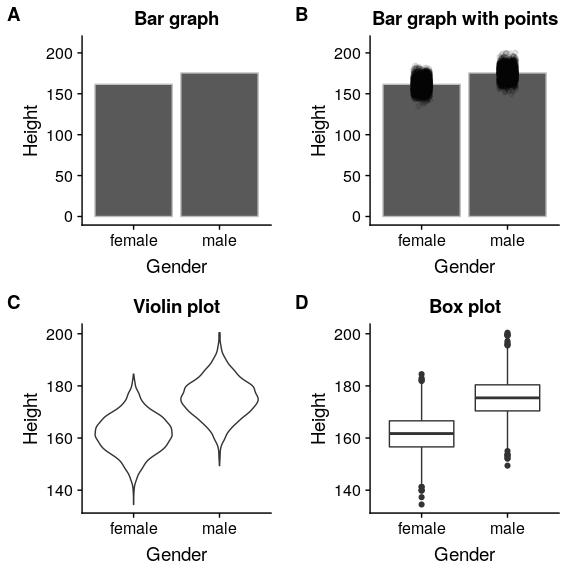
圖 6.3 nhanes 數據集中繪制男女身高差異的四種不同方法。面板 A 繪制了兩組的平均值,這無法評估兩個分布的相對重疊。面板 B 顯示了相同的條,但也覆蓋了數據點,使它們抖動,以便我們可以看到它們的總體分布。面板 C 顯示了小提琴圖,顯示了每組數據集的分布。面板 D 顯示了一個方框圖,它突出了分布的分布以及任何異常值(顯示為單個點)。
- 前言
- 0.1 本書為什么存在?
- 0.2 你不是統計學家-我們為什么要聽你的?
- 0.3 為什么是 R?
- 0.4 數據的黃金時代
- 0.5 開源書籍
- 0.6 確認
- 1 引言
- 1.1 什么是統計思維?
- 1.2 統計數據能為我們做什么?
- 1.3 統計學的基本概念
- 1.4 因果關系與統計
- 1.5 閱讀建議
- 2 處理數據
- 2.1 什么是數據?
- 2.2 測量尺度
- 2.3 什么是良好的測量?
- 2.4 閱讀建議
- 3 概率
- 3.1 什么是概率?
- 3.2 我們如何確定概率?
- 3.3 概率分布
- 3.4 條件概率
- 3.5 根據數據計算條件概率
- 3.6 獨立性
- 3.7 逆轉條件概率:貝葉斯規則
- 3.8 數據學習
- 3.9 優勢比
- 3.10 概率是什么意思?
- 3.11 閱讀建議
- 4 匯總數據
- 4.1 為什么要總結數據?
- 4.2 使用表格匯總數據
- 4.3 分布的理想化表示
- 4.4 閱讀建議
- 5 將模型擬合到數據
- 5.1 什么是模型?
- 5.2 統計建模:示例
- 5.3 什么使模型“良好”?
- 5.4 模型是否太好?
- 5.5 最簡單的模型:平均值
- 5.6 模式
- 5.7 變異性:平均值與數據的擬合程度如何?
- 5.8 使用模擬了解統計數據
- 5.9 Z 分數
- 6 數據可視化
- 6.1 數據可視化如何拯救生命
- 6.2 繪圖解剖
- 6.3 使用 ggplot 在 R 中繪制
- 6.4 良好可視化原則
- 6.5 最大化數據/墨水比
- 6.6 避免圖表垃圾
- 6.7 避免數據失真
- 6.8 謊言因素
- 6.9 記住人的局限性
- 6.10 其他因素的修正
- 6.11 建議閱讀和視頻
- 7 取樣
- 7.1 我們如何取樣?
- 7.2 采樣誤差
- 7.3 平均值的標準誤差
- 7.4 中心極限定理
- 7.5 置信區間
- 7.6 閱讀建議
- 8 重新采樣和模擬
- 8.1 蒙特卡羅模擬
- 8.2 統計的隨機性
- 8.3 生成隨機數
- 8.4 使用蒙特卡羅模擬
- 8.5 使用模擬統計:引導程序
- 8.6 閱讀建議
- 9 假設檢驗
- 9.1 無效假設統計檢驗(NHST)
- 9.2 無效假設統計檢驗:一個例子
- 9.3 無效假設檢驗過程
- 9.4 現代環境下的 NHST:多重測試
- 9.5 閱讀建議
- 10 置信區間、效應大小和統計功率
- 10.1 置信區間
- 10.2 效果大小
- 10.3 統計能力
- 10.4 閱讀建議
- 11 貝葉斯統計
- 11.1 生成模型
- 11.2 貝葉斯定理與逆推理
- 11.3 進行貝葉斯估計
- 11.4 估計后驗分布
- 11.5 選擇優先權
- 11.6 貝葉斯假設檢驗
- 11.7 閱讀建議
- 12 分類關系建模
- 12.1 示例:糖果顏色
- 12.2 皮爾遜卡方檢驗
- 12.3 應急表及雙向試驗
- 12.4 標準化殘差
- 12.5 優勢比
- 12.6 貝葉斯系數
- 12.7 超出 2 x 2 表的分類分析
- 12.8 注意辛普森悖論
- 13 建模持續關系
- 13.1 一個例子:仇恨犯罪和收入不平等
- 13.2 收入不平等是否與仇恨犯罪有關?
- 13.3 協方差和相關性
- 13.4 相關性和因果關系
- 13.5 閱讀建議
- 14 一般線性模型
- 14.1 線性回歸
- 14.2 安裝更復雜的模型
- 14.3 變量之間的相互作用
- 14.4“預測”的真正含義是什么?
- 14.5 閱讀建議
- 15 比較方法
- 15.1 學生 T 考試
- 15.2 t 檢驗作為線性模型
- 15.3 平均差的貝葉斯因子
- 15.4 配對 t 檢驗
- 15.5 比較兩種以上的方法
- 16 統計建模過程:一個實例
- 16.1 統計建模過程
- 17 做重復性研究
- 17.1 我們認為科學應該如何運作
- 17.2 科學(有時)是如何工作的
- 17.3 科學中的再現性危機
- 17.4 有問題的研究實踐
- 17.5 進行重復性研究
- 17.6 進行重復性數據分析
- 17.7 結論:提高科學水平
- 17.8 閱讀建議
- References